Mobile fintech onboarding
Improving business fintech by creating a user-friendly mobile onboarding experience for German SMEs.
Platform
Mobile (iOS & Android)
Client
Penta (Fintech)
Timeline
2020
My role
UX / Product Designer
Introduction
Penta, a Berlin fintech for German SMEs, hired me to design its mobile onboarding to boost user acquisition.
Understanding Users and the Problem
Meet Alex, a tech-savvy small business owner
The mobile onboarding experience was non-existent, and that's where my team and I stepped in.
To provide some context, Penta caters to three distinct user groups: businesses, self-employed individuals, and freelancers. To ensure efficient cost management and cater to mobile users, Penta decided to prioritize self-employed and freelance users for the initial release.

Competitive research & low fidelity ideation
Identifying Opportunities
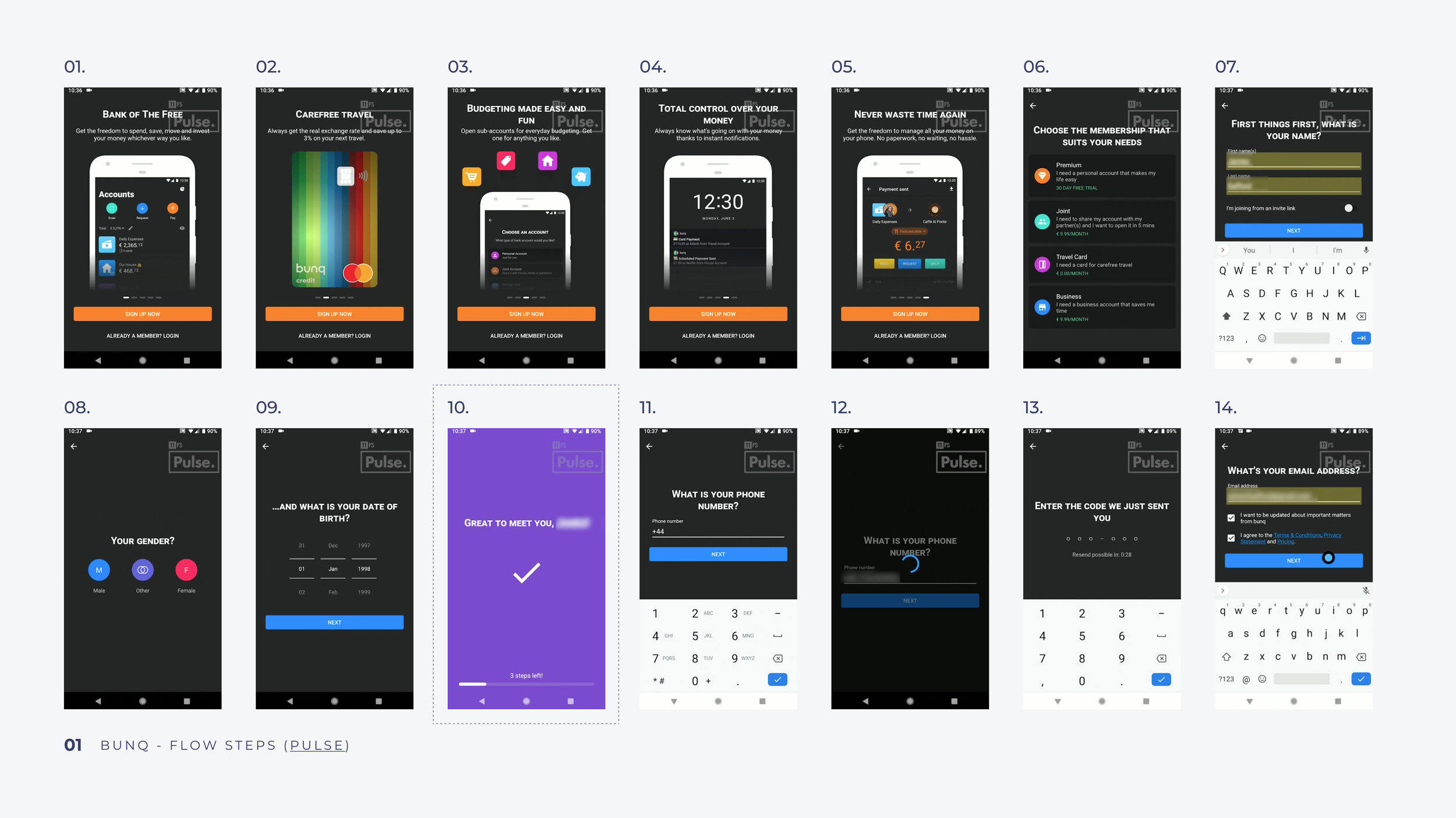
I studied competitors' onboarding processes via 11:fs Pulse, a financial service review platform. I aimed to gather inspiration while identifying and avoiding issues and dark patterns.


Minimize Waiting Time
Addressing the dreaded waiting period during data and identity verification, I drew inspiration from Monzo and Transferwise, allowing users to explore the app while their information is processed.

Streamline Address Input
Inspired by Monese's auto-fill with maps, I used Google search map services to auto-populate user fields, preventing address errors and reducing back-and-forth with the Penta help desk.

Show progression
Taking cues from Revolut and N26, I used steppers and progress indicators to reflect user progress in the Penta onboarding, which proved essential given its complexity.

Curate feature information
Inspired by Bunq and N26, I displayed key Penta features on the landing screen to help users make informed decisions before signing up. This also showcased Penta's more unknown but powerful features, such as accounting integration.

Simplify document upload
Penta didn't require photo IDs, but some users needed to submit legal documents. I proposed allowing users to select and consolidate multiple screenshots into a single document using a third-party service, simplifying the process.

User journey map
Ideating & aligning with user journey maps
User journey ideation helped our team align, visualize possibilities, and guide C-level decisions. This led to the strategic insight that prioritizing self-employed and freelancer users would be a more cost-effective approach. The journey map also aided in planning and estimating my tasks.

Audit, legacy & constraints
Playing by the technical rules
While auditing the current web app onboarding flow, I discovered that the existing back-end architecture presented challenges when it came to redesigning the mobile onboarding process. It required us to implement strategic workarounds to improve the user experience within the limitations of the back-end architecture, rather than following the ideal UX flow.
Evaluative research
Testing assumptions
I created a low-fidelity wireframe prototype and put all ideas to the test with a pool of 4 users. Feedback revealed crucial issues.
Reuse Personal Address for Business
Three out of four users wanted to use their personal address for business, leading to a necessary adjustment in our flow.

Transparency on International Support
For three out of four users clear communication about international support was essential. I addressed this frustration with an informational screen very early in the flow to set the right expectations.

Clarifying the Sign-Up Process
Two out of four users found the transition from sign-up to setup confusing. We simplified the flow with a linear experience mapped by the stepper screen.

High-fidelity & delivery
Implementing results
Take a look at the final end-to-end onboarding experience with Penta.
Success metrics
1,793 users onboarded
After implementing Penta's mobile onboarding, we achieved promising results: 724 Android users and 1,069 iOS users successfully completed the onboarding process after release. This aligned with our goals of user acquisition and attracting more mobile users to Penta.

Low cost address verification
From the outset, stakeholders and business partners emphasized the operational costs incurred due to incorrect address inputs. By limiting users to Google Maps-approved addresses, the expenses associated with address verification were significantly lowered.

Tools and processes
The right tools complete the masterpiece
Beside the tools that I used to get the job done, I was lucky to work in a team where reliability, integrity and accountability were core values. We also worked with a Scrumban delivery framework that ensured long term quality. As a team player, at times, I took over some responsibilities such as the release process.
-

11:fs
A tool designed for fintech research, 11:fs assisted me in gaining insights into competitors' UX and other financial products. It proved invaluable, particularly given the high barriers to account creation with multiple banks.
-

Miro
Miro served as an excellent tool to bring ideas to life inexpensively in low fidelity. I employed it in this project to outline the user journey, aiding comprehension, and guiding stakeholders in informed business decisions.
-

Figma
As the UX designer's preferred tool, I relied on Figma for low and high-fidelity wireframes, usability testing prototypes, and design documentation.
-

Google Sheets
While less sophisticated than other evaluative research tools, Google Sheets proved indispensable for organizing usability test results and collaborating with stakeholders on issue resolutions, all without incurring costs.
-

Design review
As the sole mobile designer on the Penta team, it was imperative to gather insights from the designers working on the web app. This allowed us to maintain cross-platform consistency in terms of UI and user experience.
-

Feature peer review
Before each code merge, I would review the implementation with the developer and the QA tester to ensure quality. This process also played a pivotal role in building trust within the team.
User delight
Storyboarding a welcome screen video
Every project comes with a mission for me: to bring user delight and boost brand awareness. This exciting task was storyboarding the welcome screen video, designed to last 10-25 seconds, presenting Penta as bold and futuristic. Unfortunately, the project didn't see the light of day due to late budget constraints. Nevertheless, I had a blast and learned how to create and pitch a storyboard.


Learnings
Navigating challenges & gaining insights
Involving Stakeholders & Communication
Engaging stakeholders early, fostering teamwork, and facilitating communication was instrumental in expediting the process and garnering support.
Persistence Amid Uncertainty
Navigating limited resources, we began development before finalizing all elements. This agile approach taught me adaptability and collaboration.