
Internet Plans & Add-ons
Aiding U.S. residents in making informed and advantageous decisions when purchasing internet plans and add-ons.
Client
Viasat (Telecom)
Platform
Web (desktop & mobile)
Timeline
2022-2023
My role
UX / Product Designer
Introduction
With the launch of new Viasat services, I collaborated with a cross-disciplinary team to help users make informed decisions when choosing the right internet plan and add-ons for their needs.
Understand & define the problem(s)
Research
Generative research
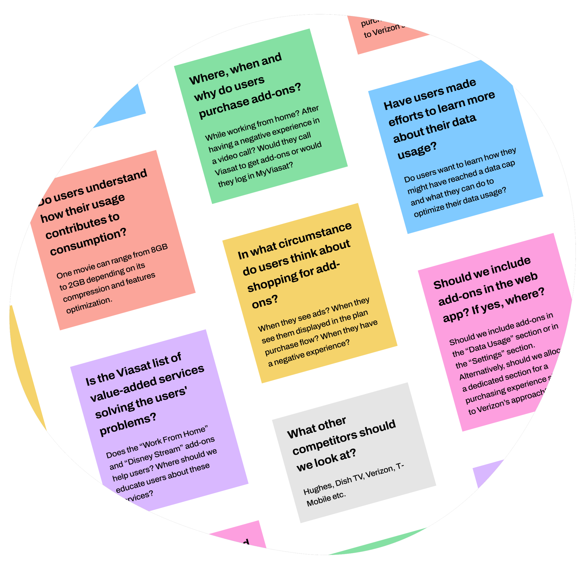
To gain insight from the user's perspective, I partnered with the Viasat research team, who conducted generative research via user interviews. Through this process, I discovered that Viasat services fell short of meeting customer expectations regarding internet functionality. Users didn’t think in terms of data speeds; rather, they perceive internet performance as either working well (high speed) or not (unlimited standard).
Personas
Two years after the onset of the first COVID-19 pandemic, the work-from-home culture became widespread, and Internet service providers, including Viasat, had to adjust to the new demands of remote work, such as increased demand for higher and faster internet speeds.
In Viasat's case, the majority of reported internet issues originated from remote or work-from-home users, with a portion of them also being parents, highlighting the overlapping needs of working effectively and entertaining their family while working.

As a remote worker, I need reliable internet service during working hours to effectively complete online tasks and attend meetings.

As a work-from-home parent, I need tools to keep my children entertained while I work, allowing me to focus without frequent interruptions.
Competitor analysis
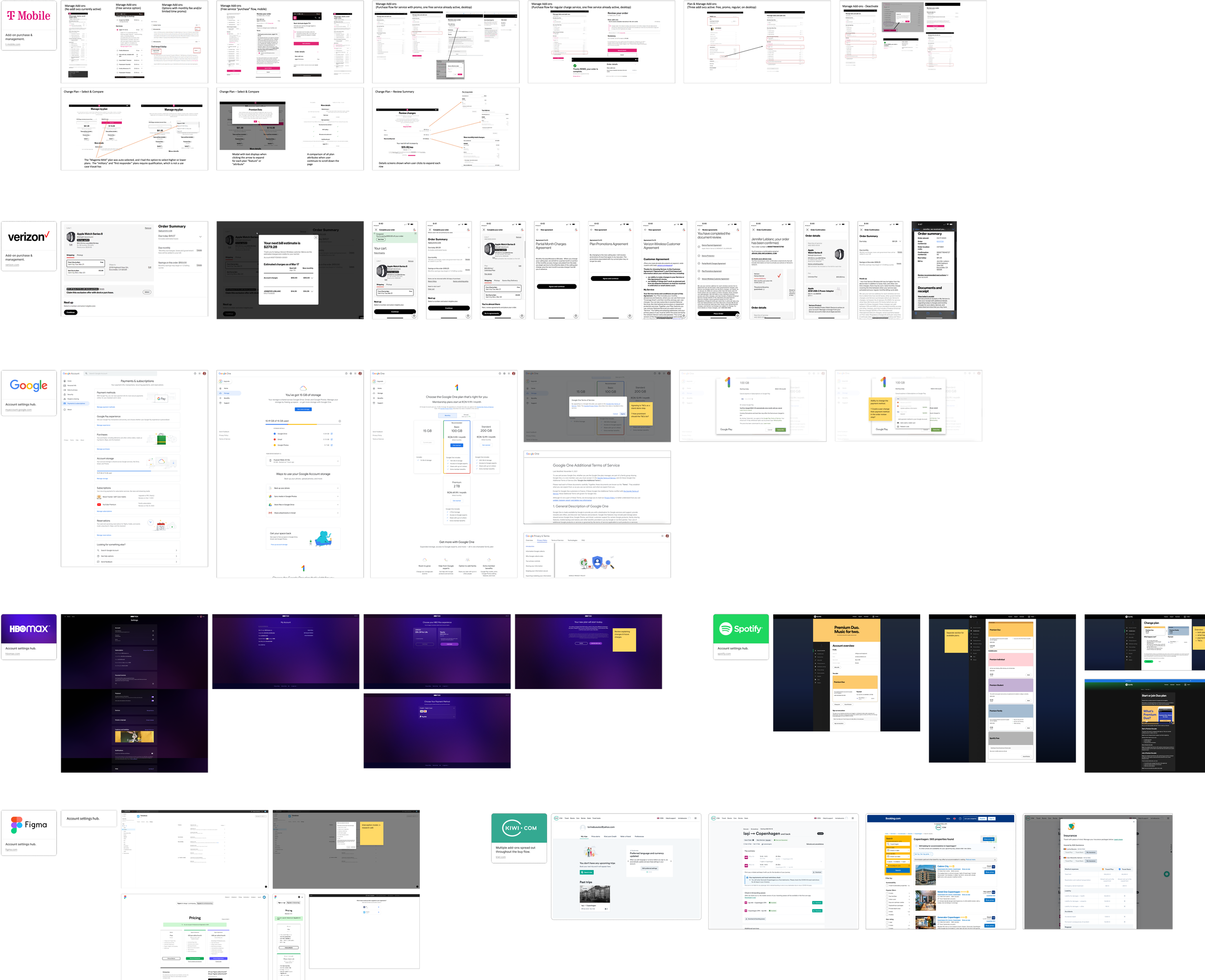
Drawing inspiration from industry leaders like T-Mobile and Verizon, as well as top products like Google and Spotify, I and my team identified UX principles to emulate at Viasat.
This research was crucial for generating ideas and ensuring we addressed key areas:
Clarity in displaying service prices, promo end dates, and cost increases.
Clear messaging for mid-cycle changes.
Implementing a concise, informative deactivation flow.
Using intercepts in deactivation processes.
Demonstrating the added value users would gain by upgrading their plan and offering alternative options for those on a tight budget.
Explore
Delving into solutions
Brainstorming
After data gathering, a couple of brainstorming sessions and affinity mapping exercises, I continued to address the following issues during the exploration phase.
1
Discoverability
• Display add-on services as promo ads (banners/cards) on relevant pages;
• Consolidate all add-ons into a single dedicated “Purchase“ section;
• Use notifications and emails as communication channels;
• Use the help service as a way to advertise better services, when users would benefit from them.
2
Clarity
• Categorize add-ons and plans according to needs (eg. “Work“, “Play“, etc.);
• Provide clear information about current plan features and emphasise their value (how much value saved);
• Compare the current plan against better plans to show users additional benefits.
3
Personalization
• Design & implement a quiz wizard to help users make the best decision when choosing a plan and add-on services;
• Showcase users recommended plans and add-ons according to their past usage;
• Surface relevant add-on services according to past user behavior.
User flows
Quick ideation
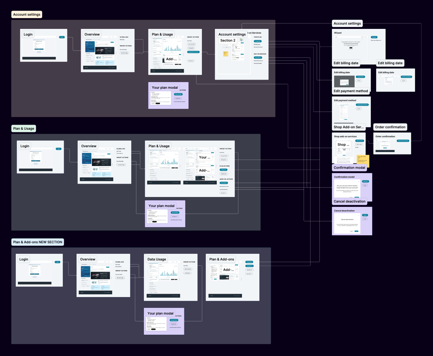
With just a few basic requirements, I began brainstorming ideas for how the user task flows could be structured, using screen mapping to help stakeholders to easily grasp the concepts visually. This process helped me set the stage for productive discussions, and gather additional requirements and insights into constraints.
Turning complexity into solutions
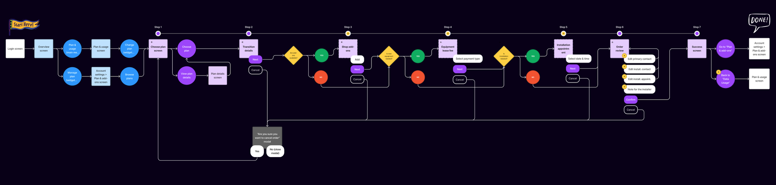
While analyzing and integrating the detailed documentation provided by the PM, I considered the diverse needs of Viasat users while adhering to technical requirements.
For example, transitioning from an older plan to a new one involved ordering and paying for dish equipment and professional installation, while users with the latest satellite dish that wanted streaming services only needed a modem they could easily install themselves. The former user would have to make an installation appointment, whereas the latter would not.
Mapping out all these use cases helped me and my stakeholders anticipate all possible scenarios, laying the groundwork for the wireframing step.

Ideate
Wireframing
Change plan
• I tackled the task of presenting plans within an existing layout (approved & tested) while enabling comparative viewing in a table format.
• Additionally, I ensured clear communication of transition fees and extra charges, such as lease and installation fees.
• I also optimized the cart presentation for a seamless experience, allowing users to see bill increases and immediate payments upfront.
• Lastly, I fine-tuned the flow logic to accommodate varying user journeys, whether users skipped steps or scheduled installation appointments.
Add-ons
• I prominently featured add-on advertisements in the overview section and add-on management in the Settings section.
• I streamlined the purchase process to a single step for user convenience.
• Additionally, I implemented a feature for users to view and review QR codes for add-ons requiring app installation.
• I also prioritized easy cancellation and reactivation of add-ons and integrated an interception experience to gather user feedback and offer participation in customer research.
• Throughout, I maintained clarity in pricing, promos, and cancellation details, drawing inspiration from Google's design patterns.
Plan selection tool
• Implemented a quick and straightforward quiz to suggest the best plans based on user needs.
• Incorporated a step where users specify their reason for plan changes, providing valuable data for business insights.
• Demonstrated empathy by inquiring about user budgets and offering a budget-friendly plan option.
• Ensured seamless integration with the change plan flow, resulting in a cohesive user experience.
Implementation
Collaborative handoff
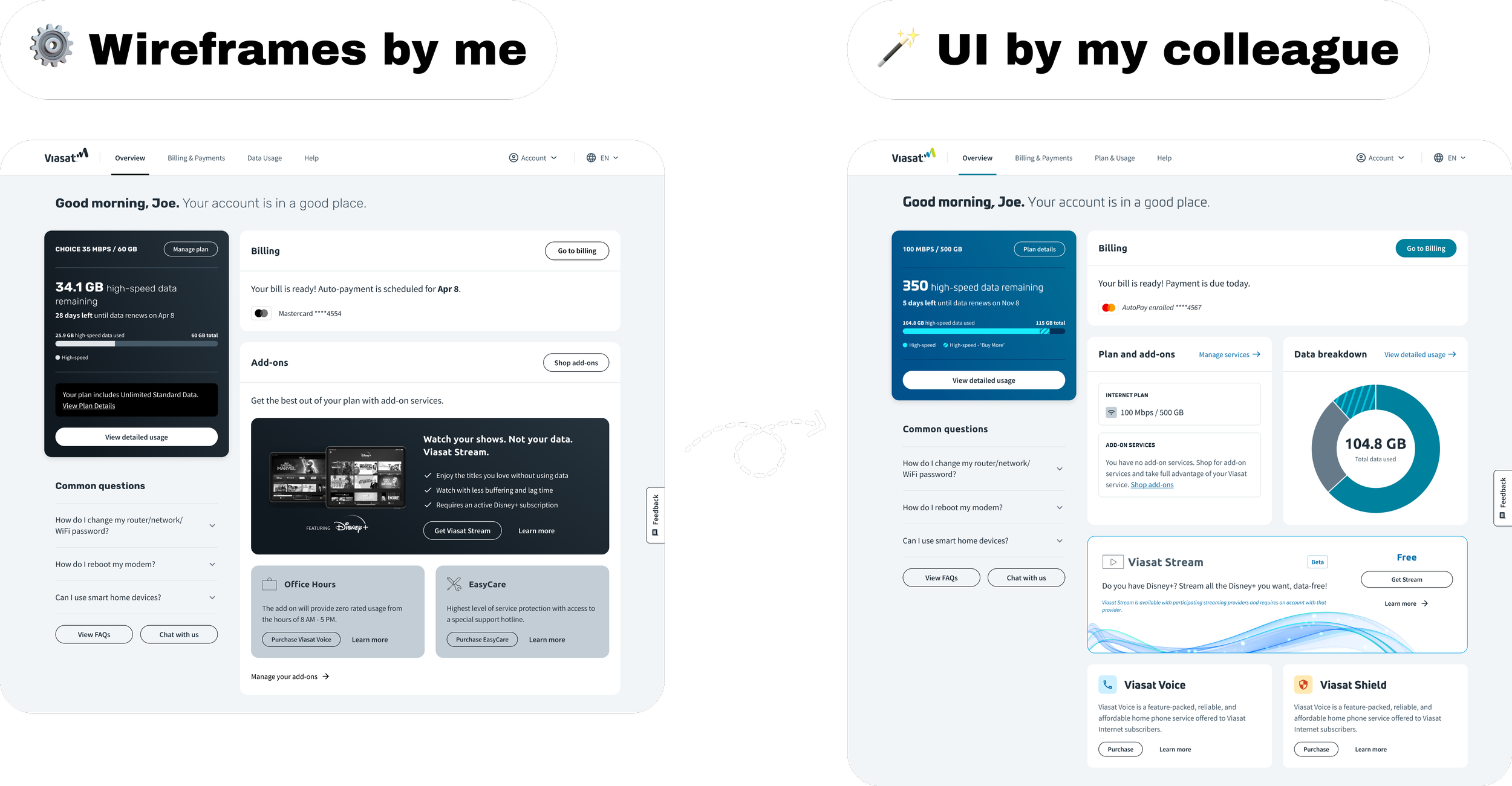
After clarifying the project's direction, it was time for the UI phase. At the time, I had to transition to a different effort so I handed off my work to one of my colleagues to ensure continuity. This transition brought both challenges and growth opportunities, emphasizing collaboration and delegation as essential for the success of the project and for my career development.
I made sure to maintain clean and accessible work to help any designer seamlessly continue where I left off. Furthermore, my colleague and I maintained close communication across two different time zones (EEST & EDT) during the whole process, ensuring both of us were equally involved in all discussions to facilitate a smooth transition.
Value delivered
Impact & legacy
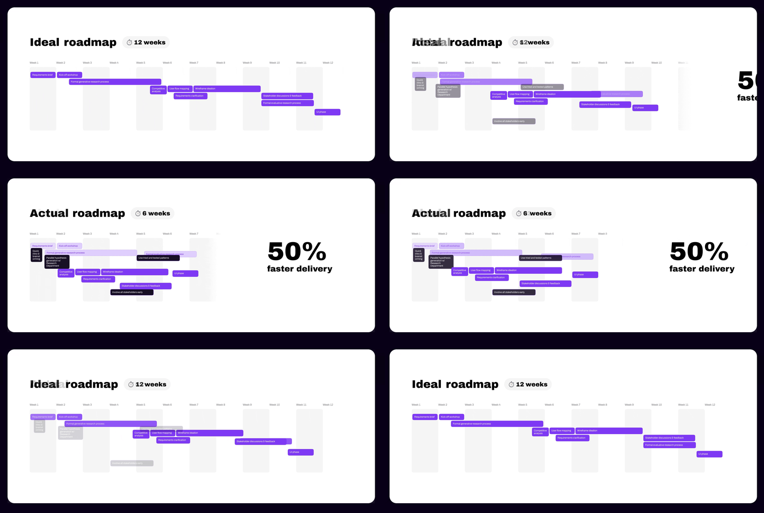
I played a pivotal role in clarifying project requirements through mapping exercises and fostering team discussions to ensure common understanding and team contribution.
Additionally, I recognized the need to push for tangible outcomes and emphasized the urgency of translating ideas into tangible prototypes. This approach facilitated decision-making with stakeholders and expedited the UI and development phases by 6 weeks.
The new plans and add-ons were released ahead of schedule, allowing Viasat to gather early user feedback, and generate revenue sooner.
Learnings
Navigating challenges & gaining insights
Collaboration is key
Whether it was collaborating with researchers for generative research, handing over work, or coordinating with stakeholders across four different time zones, collaboration and communication was vital to the project's success.
Turning complexity into intuitive UX
In managing the plan migration process, I had to interpret intricate condition tables that influenced user flow dynamics. I prioritized simplicity and comprehensibility to educate and guide users through their unique migration journey.
Think strategically
In past meetings, I observed stakeholders overly fixating on UI details too soon in the process. To address this, I used design system components but gave them a low-fidelity look. The design team loved this strategy and embraced it moving forward.