Transforming Legacy Utilities Reporting
Redesigning a 10 year old B2B2B utilities platform.
Client
THG Energy
Platform
Web (desktop)
My role
UX / Product Designer
Timeline
2024-2026
Introduction
This project focused on redesigning and rebuilding a 10-year-old B2B2B utilities reporting platform used by agents, brokers, end-customers, and administrators to manage utility data, reporting, and sustainability workflows.
1
Product
Increase client trust and support long-term retention
2
Business
Demonstrate the product's value to secure continued investment
3
Scaling
Build a scalable foundation for future growth and team expansion
Empathize & problem framing
Key Challenges
Data clarity & gathering
Users struggled to trust and access their data, while fragmented workflows made account creation slow and inefficient—taking up to 90–120 days.
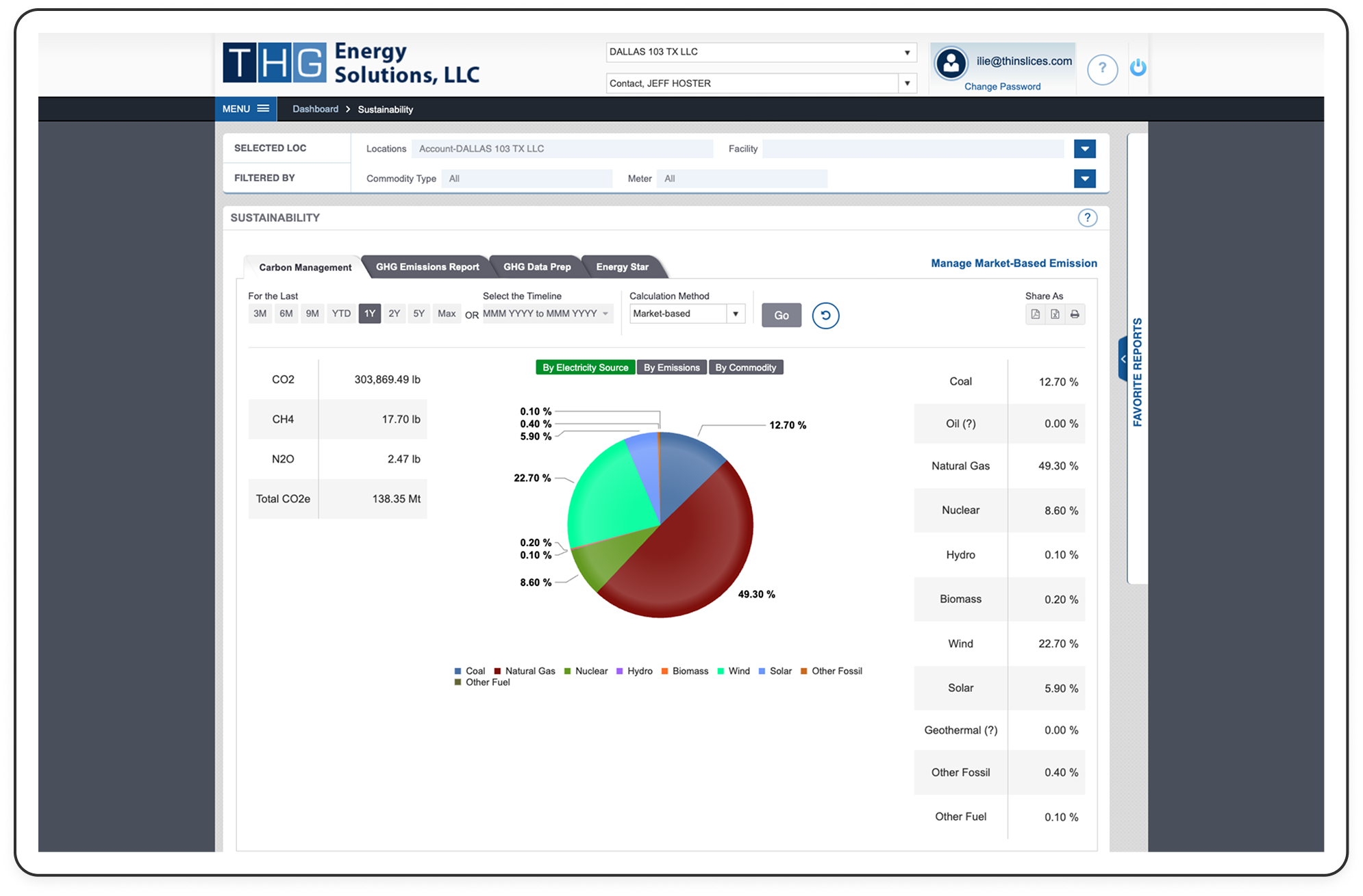
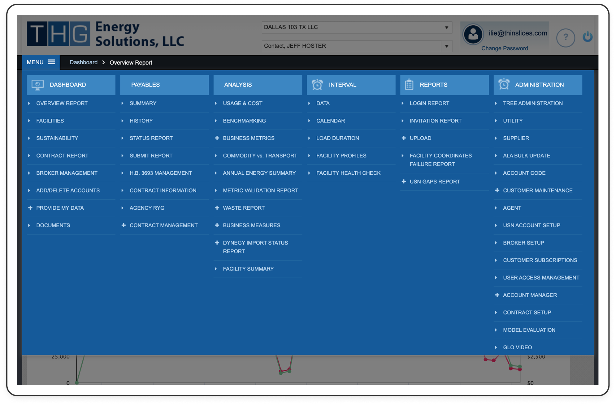
Invisible product value
Users struggled to recognize the platform's full capabilities because navigation and information architecture didn't reflect their mental models, leaving valuable reporting features underutilized.
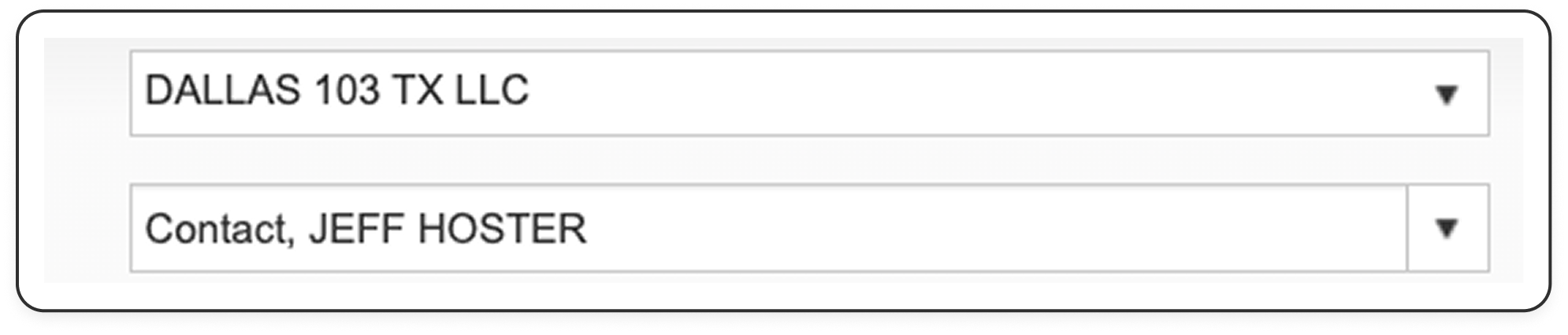
Agent / broker needs
Agents lacked a unified view of their customer portfolio, making it difficult to navigate between accounts and manage client relationships efficiently.
Subaccounts Management
Easy transferring, viewing, copying, and sharing of subaccount details empower users to manage their accounts effectively, hence they were prioritised and featured in the Account details section.
Transaction Redesign
External accounts and subaccounts were separated into distinct tabs, streamlining transaction management. Outgoing account selection and editing were optimized, and the success screen was enhanced with animatioins, clear actions and a primary button leading back to the initial screen.
Evaluative research
Usability testing
Issue 1: Unclear visual triggers & actions
Solution
I removed the unclear & superfluous action links and replaced them with contextual interactions. I also moved the search button that lead users to believe it enabled global searches to the transactions bottom-sheet where it was context-dependant. Balance inclusion and reordering proved unhelpful for users at the time, so they were deprioritized.
Issue 2: Unclear navigation when initiating transactions
Solution
The transaction initiation was unclear for users because they couldn't differentiate between initiating an internal transfer between their own accounts and initiating an external transaction. The solution involved using a bottom-sheet that included these two distinct actions.
Adapting to unforeseen challenges
Ready to pivot
Standard scroll fallback plan
A React Native library component, the bottom-sheet, raised concerns during development. Since we lacked resources to develop our own component, I prepared a fallback plan using a standard scroll. Upon confirmation of the component's limitations, the team swiftly switched to the fallback plan, demonstrating adaptability and collaboration.
Operational setbacks
Having to pay Apple and Google a fee prevented us from offering the option to add subaccounts in the app. This setback was significant because creating subaccounts was a key revenue source for Penta. To address this issue, I replaced the section for adding and managing multiple subaccounts with a marketing section that encourages users to create subaccounts on the web app instead.
Success metrics
Surge in subaccount creation
We coordinated the release of the subaccount features with the marketing team to maximize impact. The marketing campaign combined with the user experience led to a nearly 50% increase in subaccount creation within the first month of release. This marked a significant business success, considering that subaccount creation was a key revenue driver for Penta.

Learnings
Navigating challenges & gaining insights
Be prepared to pivot
Sometimes things don’t go according to plan, whether due to operational challenges, resource constraints or development obstacles. I've learned not to be disheartened by setbacks but instead to quickly devise heuristic solutions and always have a backup plan in place.
Keep It Simple, Stupid
Was the bottom-sheet truly necessary for a great user experience? Not really. The need to remove it from certain screens due to development challenges made me question whether it was the optimal choice in the first place or if I was simply driven by my ego. This experience taught me that simplicity can often save a project.